Ripl: Welcome Experience
A first impression experience informing
small business owners the value of using Ripl

Product Design | Ripl
Objective
Create a new welcome sequence for iOS and briefly explain to users what is valuable about Ripl
My Roles
UX Designer, Copywriter, Visual Design
Timeline
2 months
Growth Team
Ping // Creative Director
Andrew // VP of Growth
Benny // Developer
Rodney // Developer
Tools
Sketch
Principle
Getting started
Ripl is a social video maker app for small business owners. As part of the Growth Team, I was tasked with revising the welcome experience as a way to introduce new users to the value of the app and encourage them to stay. I worked with the VP of Growth, Creative Director, Videographer and Senior Software Developers to create this new experience.
The business goals
For this project, we had set benchmarks for the new experience to be considered a success.
+ Increase first time share by 10%
+ Reduce trial churn by 10%
Competitive and Self Audit
Before I designed out the new flow, I printed out the current Ripl onboarding experience as well as the competitors’ flows, and held an open-room critique to the company. Colleagues walked through the flows, left smiley stickers on what they liked and wrote their thoughts alongside the screen printouts.
The current flow

The pin up and open critique

After the pinup, I noted that the current experience was too long and tedious with too many options. The company wanted a refreshed feel, for it to be a fun, value-driven welcoming from beginning to end.
Case study
Additionally, I performed a case study of various types of welcome experiences and noted two main styles for apps that did not have the same recognition as Facebook, Airbnb, Lyft, etc.
The Instructions Guide
You learn about each step it takes to accomplish your goal through the app.
The Three Values
You learn the majore values the app has to offer you.
Moving forward, I had some design choices to consider:
1.
Do I go with instructions or the values?
2.
Should the screens be an automatic carousel or manual swiping/taping?
3.
Would we visualize through illustrations or pictures?
4.
Should the "Log in" button be constantly fixed?
5.
Should signing up/in be required to enter the app?
Design Iterations
I began prototyping wireframes from low-fidelity to high fidelity with animation. Each of the iterations were influenced by how Ripl wanted to showcase their values and identity. We held meetings on copy and visuals, and I conducted informal user testing to provide outside voice. Throughout this process, I designed at least six iterations (even after dev handoff).

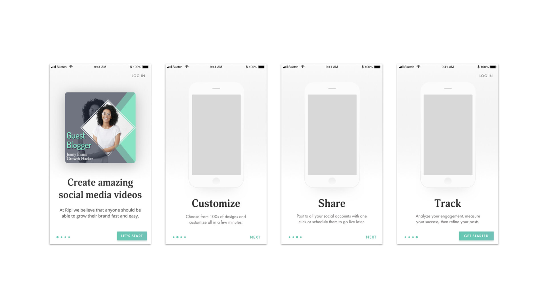


The Final Design
After successful reaction to the A/B test, the final design was fully developed and released to the public.
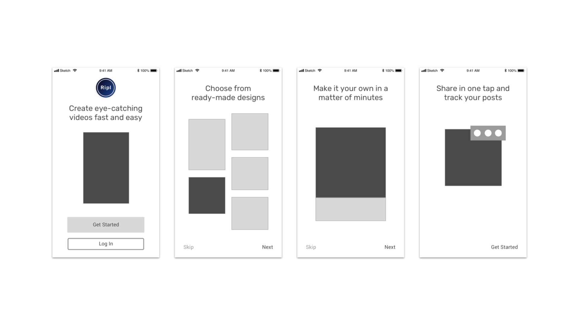
The Wireframes


The Values
For first time users, I wanted users to really absorb what makes Ripl great for their small business by having the manually tap/swipe through the values before signing up.
Pick a Category
Ripl is able to personalize templates based on what kind of business they have. Handling a business can be messy, and I wanted them to see something clean and organized– show that they could trust us.


What's in a name?
I wanted to really make their business name bold because having a business is no small feat! It's always nice to see your name front and center like a beloved prize.
The bounce
To give some playful delight, I had our developers give this little arrow some bounce to direct users who wanted notifications.

Asessing business goals
After the app release, we noted that overall the new flow was performing extremely well compared to its predecessor.
+ More than expected increase in first share rate
+ Improved increase in trial attach
+ Small, but to be expected increase in trial churn
Future considerations
Allow for a "Continue as Guest"
I believe there is for what I like to call, "The Long Game." Giving users the independence to explore the app and really see if it's worth their time. And if it's not, then there's deeper issues to solve for than with a welcome sequence.
Lessons Learned
Brand is tied to UX
The brand of the company greatly influences the welcome experience. Since this is where the first real impression takes place, it should be as aligned with company’s mission and values as possible. This goes throughout the product.
More unbiased user testing
It's relatively easy to get caught in group think or whoever has the loudest voice especially without a product owner. I believe if I had conducted more iterative user testing, the unbiased insights would have been helpful in guiding the design.