
Windrose Magazine
An indie magazine on the formative years of adulthood

Visual Design | Freelance
Objective
Produce a print magazine
My Roles
Curated photography and art, handlettered title pages, compiled typography, and organized magazine cover-to-cover for two issues. Created content and campaigned for Kickstarter.
Timeline for Issue 1
Three months
Timeline for Issue 2 + Kickstarter
Two months
Team
Ally Willis, Editor-in-Chief
Kendall Cherry, Head Writer
Tools
Google Docs
Illustrator
InDesign
Photoshop
Acheivement
Raised +$5,000 for Issue 2 Kickstarter
into Windrose
After doing some work for That First Year, the predecessor of Windrose, the owner Ally Willis had asked me if I was interested in designing a print magazine. Of course, I said “Yes.”
The purpose of That First Year was to de-stigmatize the hardships of that first year after undergrad. The magazine, on the other hand, meant to go deeper than just the first year, but the formative years of adulthood. In our email exchanges, I offered up the name “Windrose” as an old term for “compass.” In this way, the magazine would act as a compass to the wanderers searching for their purpose. And from this, the tagline, “Words for Wanderer” reinforces that mission.
Issue one
With each article, I annotated words and lines that lifted off the page. Each composition contained its own soul that required a correlating layout to represent it.
Minimal and Lovely Layouts
All the layouts were well-balanced, simple yet sophisticated. For "be where you are", I designed a blue-toned, airy, whimsical experience.


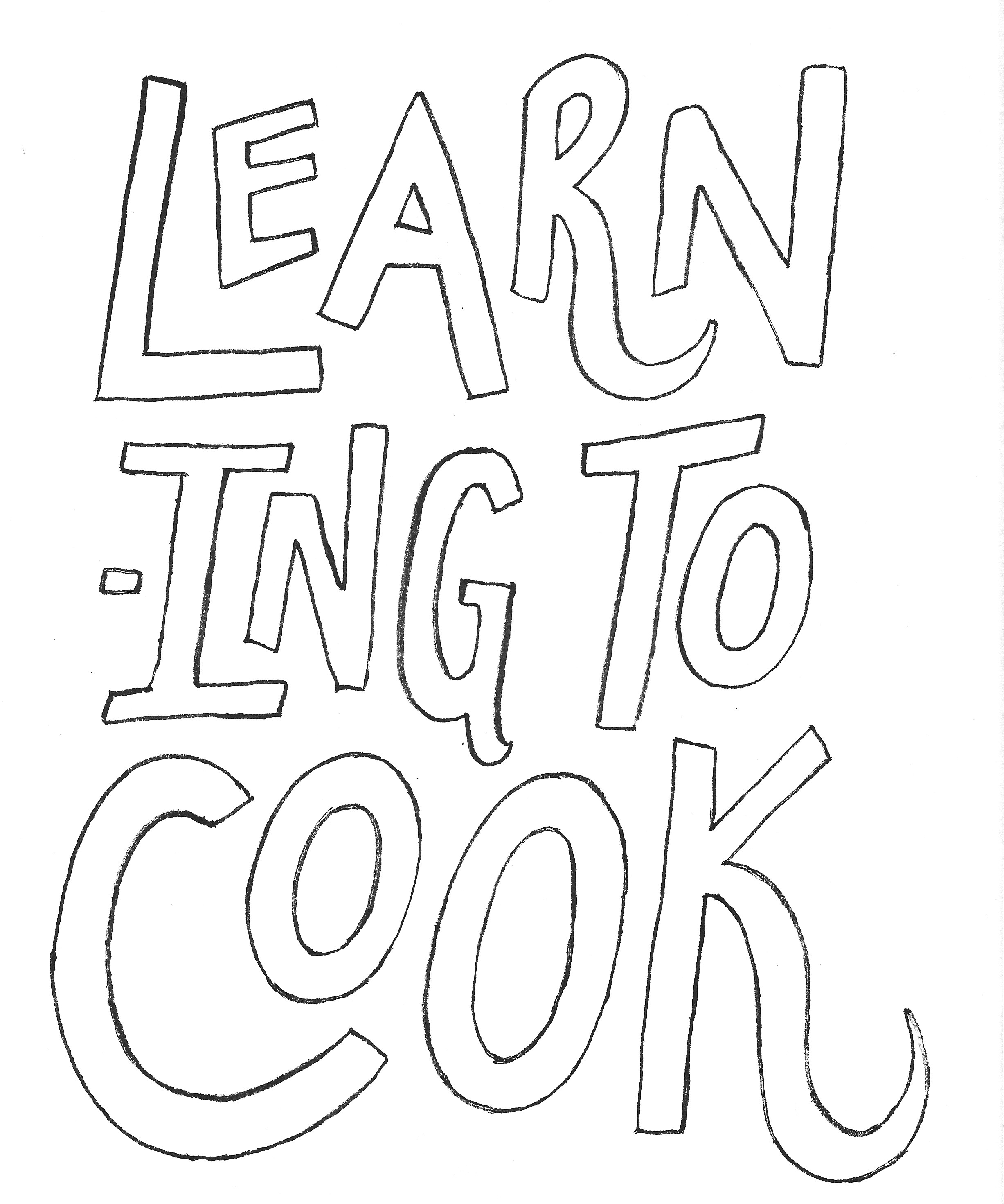
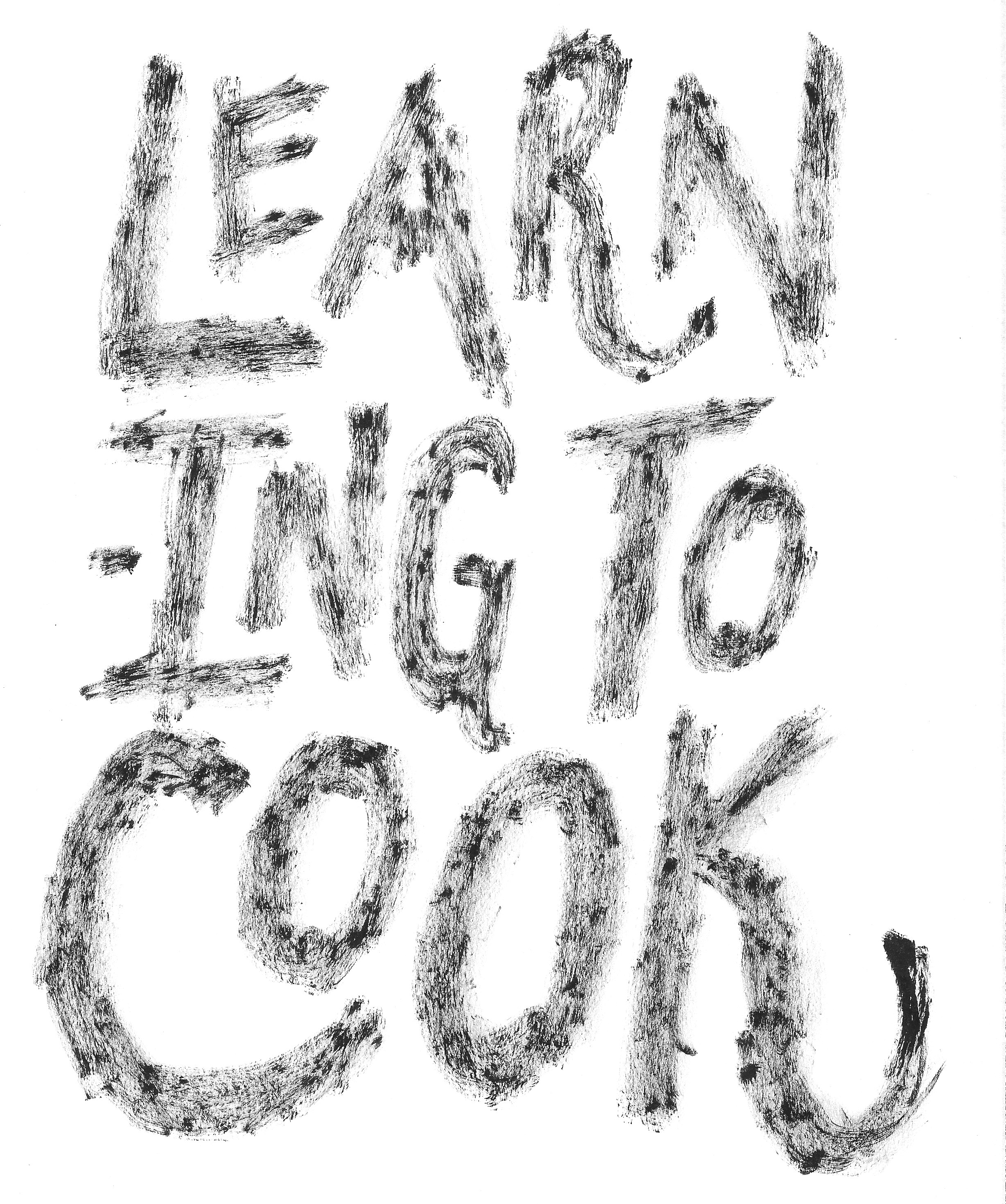
handlettering
For the "Learning to Cook" piece, there was this undeniable quirkiness to it that I wanted to explore as a cover page. Inspired by Mary Kate McDevitt's hand-letterings, I decided to letter this piece myself.
After various quick sketches, I went forward with this fun, jumbling of letters and created an outline. Vectorizing the outline in Illustrator, I printed it out and went over it different texturing techniques on tracing paper.
Picking out the two styles I wanted to overlay on the text, I used Photoshop to edit the coloring and opacity. After final edits, the hand-lettering was complete for the cover page.


Issue Two
The second issue matured with a higher standard of artistry. Learning from the experience of creating Issue 01 and the developed direction of Windrose, I continued a minimal, but exploratory aesthetic.
Elevated Look
I pushed the tagline "Words for the Wanderer" from the bottom margin to the center right under the title for a tighter look.
I continued the tradition of a wrap around cover of an ambigious figure in the presence of nature representing the wanderer, our readers, through life.
Dramatic Flair
This issue, I experimented more with photography and text to present the story in a captivating display.
Updated Quotes
I adjusted the quote typography from a calligraphic style to a san-serif as to stray from being too feminine and more gender-inclusive.
The Kickstarter
To raise money for the print order of Windrose Issue 02, we held a Kickstarter. I created and reiterated on content and copy on social media, and pushed for a video as it was the best way to storytell and gain emotional and monetary investment. With one day left, we successfully completed our goal of $5000.

Reflection
Working on Windrose was an honor in that I had the responsibility of taking these stories and framing them for the world to see. This project was a mixture of art, design, literature, and soul. And within those pages is my soul holding each letter.
And it gives me great joy in that I can produce beautiful, elegant work.